Uploading 993 images to Wikimedia Commons in one go

16001000413824-Jukkasjärvi-Riksantikvarieämbetet

Sami children practising reading in the outdoors. Photographer: Unknown. Due to the date of the photograph the Swedish National Heritage Board has marked it as in the Public Domain.

 A couple of weeks ago I uploaded 993 photographs from the Swedish National Heritage Board’s image archive to Wikimedia Commons (on their behalf and with their agreement the of course!). The images uploaded cover Sami life in the North of Sweden and also motifs from the Swedish province of Västerbotten in general and will be of especially good use in Wikimedia Sweden’s Umepedia and Now and Then competition. Gradually the images will also find their way into Wikipedia articles and thus help fulfill the National Heritage Board’s mission of making information about Sweden’s heritage as widely and freely available as possible.

Thankfully I didn’t have to upload them one by one but could upload them in one batch using the GLAMwiki toolset. The raw materials I used was an export of the 993 objects from Europeana in XML-format. Making the export was easy as we at Europeana developed an export script to make it easier for our partners to have their collections uploaded to Wikimedia Commons should they want to .

To improve the discoverability of the uploaded collection on Wikimedia Commons I created a mapping between the National Heritage Board’s subject/motif classifications and the closest corresponding categories on Wikimedia. Categories on Wikimedia Commons have to be in English so I couldn’t use the original Swedish classifications. Using a little data wrangling script a colleague of mine made for me I then added the categories to the XML-document.

With the data prep finished I then used the the GLAMwiki toolset to create a mapping from the XML-file format to the Photograph template on Wikimedia Commons, previewed the result, and then uploaded the batch. Creating the mapping was made easy by the tool’s simple visual mapping interface and I used the beta version of Wikimedia Commons to do a number of test uploads before actually pressing the button on the final upload.

While the tool makes it easy to create a batch upload it’s still essential that you understand both the source collection and the structure of Wikimedia Commons. The tool can’t do that for you! So, if you’re working for a GLAM and want to contribute to your instution’s mission by sharing your content with the world via Wikimedia Commons and Wikipedia please do get in touch and we will provide advice and, as much as we can, hands-on assistance. The same goes if you’re a developer and want to help improve the tool! Just as all Europeana and Wikimedia software the toolset is of course open source.

The GLAMwiki toolset was developed in a collaboration between the UK, Dutch, French and Swiss Wikimedia chapters and Europeana. Other collections that have been uploaded are from the British Library and the New York Public Library (the latter a work in progress).

Posted in API, Europeana, Wikipedia | Tagged , , , | Leave a comment

Big in Europeana – Japanese ceramics

Last week I started a blog series about how Japan has always fascinated the West and how this has led to extensive collections of Japanese art and crafts in European museums. I started off from TV-series Shōgun and ended with mentioning Japanese ceramics as among the type of artefacts I’d write more about.  So let’s get started where we left off.

Japan is actually the country where pottery was first created! This the world’s first pottery tradition is called Jōmon and is more than 10 000 years old. However, these pots were never exported to the West I’ll start off instead with the kind that first was: Kakiemon porcelain.

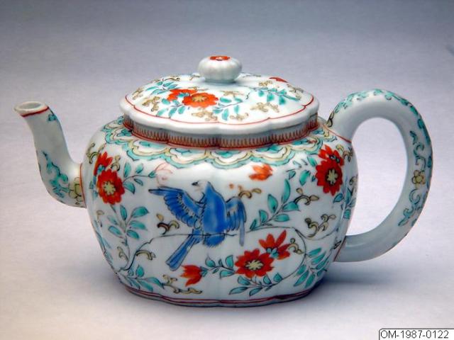
Kakiemon style teapot

Kakiemon style teapot. Courtesy of the Swedish Museum of Far Eastern Antiquites. Photograph is CC-BY-NC-ND

The Kakiemon style porcelain was created by Sakaida Kakiemon in the middle of the 17th century. During this period there was political unrest in China and so the Dutch East India Company turned instead to Japan and so Kakiemon became the first Japanese porcelain to be exported  to Europe.  Once arrived here it became so popular that European faience and later porcelain makers copied the style extensively.  For this reason both real Kakiemon porcelain and Kakiemon styled European pottery are well represented in Europeana!

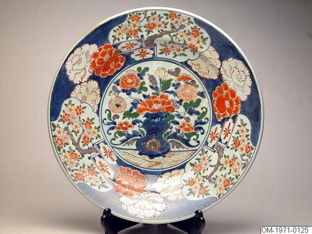
The Kakiemon style porcelains were produced in the city of Arita where also another popular style was produced, Imari. The Imari porcelain is very colourful and often combines blue, red and gold.

Imari plate, courtesy of the Swedish Museum of Far Eastern Antiquities.

Imari plate, courtesy of the Swedish Museum of Far Eastern Antiquities. Photograph is CC-BY-NC-ND.

Europeana has a very extensive collection of Imari porcelain to explore!

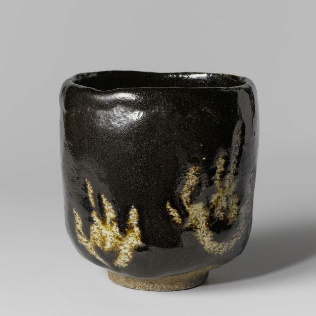
The final style of Japanese pottery I’ll write about is also my favourite. Where Kakiemon and Imari are rich and colourful Raku ware is simple and spartan. If the glaze and the form hadn’t been just SO you would even think that Raku pieces are the work of failed apprentices!

Raku teacup with flame decoration. Courtesy of the Rijksmuseum.

Raku teacup with flame decoration. Courtesy of the Rijksmuseum.

As you can see from the small collection of Raku ware that we have in Europeana most pieces are teacups. The reason for this is that Raku is closely associated with the Japanese tea ceremony and its aesthetics.

I hope you enjoyed this quick introduction to Japanese pottery! Next week: clothing and clothing details.

Posted in Blog series, Europeana | Tagged , , , , , , , , | Leave a comment

A blog series: Big in Europeana – Japanese art and artefacts

It was 1984, I was 12, and Shōgun was the TV-series all the kids were talking about. The violence! The nudity! The subtle aesthetics of Japanese art and crafts! Well, maybe not so much the last, or if so only subliminally,  but this TV-series did actually spark a much deeper interest in the history and art of Japan. I simply devoured the book by James Clavell that inspired the TV-series!

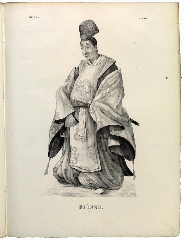
Dutch engraving depicting the Shogun

Dutch engraving depicting the Shogun

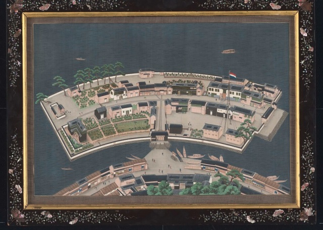
But I was of course not the first Westerner to become fascinated by Japan. Already Marco Polo wrote, but never visited, the island of Cipangu. Portuguese traders were to become the first Westerners, in 1543, to visit Japan and after them came a stream of other merchant adventurers one of whom was William Adams, the English sailor who inspired the book that inspired the TV-series Shogun! We do of course have the adventures of William in Europeana. Now, while William was an Englishman, he arrived to Japan on a Dutch ship (the Liefde) and it was to be the Dutch who would ultimately be the only Westerners allowed to trade in Japan from the 1630s. The Dutch were confined to the artificial island of Deshima, in the harbour of Nagasaki, and were only allowed to travel in the country to regularly pay tribute to the Shogun in Edo. Even so, Deshima was for 2oo years the place through which Japanese arts and crafts were exported Europe and European silver and science entered Japan.

Painting of the island of Deshima by Keiga Kawahara

Painting of the island of Deshima by Keiga Kawahara

Finally, the other European powers and the USA, could take it no longer. Desiring access to the Japanese market Commodore Matthew Perry of the US Navy sailed four ships into Edo Bay in 1853 to open the country at literal gun point! Fearing subjugation the Japanese transformed their society as part of the Meiji Restoration and adopted Western technologies at a rapid rate! But the opening of Japan also led to an increased flow of art and artefacts to the West. Western artists were inspired by Japanese art and Western collectors were, like the 12-year old me, fascinated by the subtle aesthetics of Japanese art and crafts!

The trade that trickled through Deshima and then flowed from 1854 onwards has of course led to large collections of Japanese arts and artefacts being present in museums across Europe. I will be following up on this blog post with a series of posts showing off some of those collections of Japanese prints and paintings, swords and armour, clothing and clothing details, porcelain and other ceramics.

Stay tuned!

Posted in Blog series, Europeana | Tagged , , , , , , , , , , | 1 Comment

Greta Garbo – an iconic face

Just happened to make a search in Europeana for Greta Garbo (link goes to the preview of our new portal). We’ve got some wonderful pictures of her indeed! Thought I’d share. Or launch a thousand ships…

Posted in Europeana | Tagged , , | Leave a comment

A little test…

I’m just testing something. Nothing to see here really! 🙂

Creative Commons License
Posted in Uncategorized | Tagged | 2 Comments

My Europeana Plenary, part II: The Product Development Session and Hack4Europe

And now the two activitities that demanded most of my attention in Leuven. In some ways my experience was one of scurrying between the hackathon bullpen and the main plenary venue close by.

The Product Development Session

As Product Development is my main responisbility at Europeana it fell on me to arrange this session. I wanted the session to focus on best web development practices in general  and to showcase some specific sites I think are at the cutting-edge in functionality and design. The topics of the presentations also needed to match the theme of the plenary which was “Connecting Society Through Culture”.

In terms of format I didn’t want a series of long presentations, but decided to split the two hours at my disposal into a first hour of three presentations and then a more interactive session comprising two sites being Web Critiqued. The format for the latter I stole shamelessly from Museums and the Web.

To speak about designing your site for the ever changing web and the unknown future I invited the Standardistas. They spoke about how the web has always been responsive and that more than ever we need to return to the basic principles of the web in order to serve our users (and their myriad of devices!) the best.
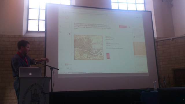
Petr Pridal presenting Old Maps Online.

Petr Pridal presenting Old Maps Online. Photograph by myself which explains the quality.

Second up was Petr Pridal who spoke about Old Maps Online, the technology it builds on and how this map project took help from the public in getting 1000 maps geo-referenced in a couple of days. I invited Petr because Old Maps Online is the best search service for historical maps yet built. And also because he combines entrepeneurial spirit with technical insight in a way that I think is sorely needed among GLAMs.

Our third speaker was Nick Stanhope of Historypin. I invited Nick because Historypin are the best at what they do. Which is to create a web presence where photos from the public and GLAMs both can be combined to form the basis of stories and comparison between past and present.  Many GLAMs attempt to do this themselves (and fail) so why not instead create a channel on Historypin?

We ended the session by having two sites, both based on content from the public, critiqued by the speakers and by the audience of the session. The two sites critiqued were Europeana 1914-1918 (represented by myself) and Platsr (represented by Maria Logothetis) and we both received a lot of constructive critique and good advice on how to improve our sites. One common critique for both sites was: Keep It Simple Stupid! We GLAMs tend to raise too high thresholds for sites to be truly participative.

Overall, I’m pleased with how the session turned out. I think the presentations were well-received and it was good to see a lot of business cards and contact information being exchanged between speakers and between speakers and audience. I dare say we haven’t seen the last of each other!

Concerning the Web Critique I was a little bit dissapointed in the low level of engagement from the audience/session participants. The form was an experiment and I think that next time I think I’ll go for something more intimate and small-scale as well as try to brief the participants better than I did this time. This was a learning experience, I’ll do better next time I think.

Hack4Europe 2012, the Leuven edition

As we did last year we’ve organized a series of hackathons across Europe as part of the Digital Agenda. Two had already been held in Warzaw and Riga with Leuven being the final and biggest one. To get a feeling for what went on check out the last few days of Tweeting the Hack4Europe hashtag.

We had about 25 developers participating who together built an astonishing 12 prototypes! Four winners were awarded and pretty much all prototypes demos were functioning and with links to the source code. It was a great experience, good fun and I hope all developers who particiated will continue to develop their prototypes and release them into the wild! I will write more about prototypes and try to link to all of them in a follow-up post. For now though I’d like to write a little bit about the hackathon format.

The Hack4Europe bullpen in Leuven.

The Hack4Europe bullpen in Leuven. Photo by myself.

Like many others have noted it’s probable that we’re at peak-hackathon (to  borrow a phrase from the oil industry). At no time before has the format been so popular with so many hacks vying for attention. I think it’s time to review it, adapt it and move forward with something different next year.

I think one aspect to improve is to make the events more cross-disciplinary. Basically by inviting enough people to ensure that each team is  a combined UX and Engineering team. For our sector in particular I also think it would make a lot of sense to add content experts and curators to the mix. I believe this would make for more of a challenge (both in organising and participating in the event) but also for the event to be more productive and an opportunity to break down some silos. As an added bonus I think it could also help in evening out the skewed gender ratio typical for most hack events.

I hope we’ll get the opportunity to try some of the changes listed above, and by others who have thought on how to improve the format, in Hack4Europe 2013! On a more personal level I wouldn’t mind doing more of a hackretreat than a hackathon…

If you have thoughts about how Europeana could improve its hackathons don’t hesitate to share them with me!

Posted in API, Europeana | Tagged , , , , , , , , | 1 Comment

My Europeana Plenary, part I: Europeana 1914-1918 and the eCloud

My last week was very much dominated by first preparing for and then attending our bi-annual plenary. I thought I’d share a summary and some thoughts of the event from my perspective. If that sounds boring just check out my colleague Neil’s photo-montage below and then bounce!

In the plenary programme there were two entries that were my responsibility, the hackathon and the product development session, and two were I took part, the Europeana 1914-1918 debriefing and the eCloud installation. I’ll do the latter two in this post and follow up with the first in a second (I’m highly logical that way…).

Europeana 1914-1918

My part of the Europeana 1914-1918 was pretty much to report on the recent re-design of the site. We also discussed some possible major further developments, like e.g. to shift from the current “moderate first, publish afterwards”-model to a “publish afterwards, moderate afterwards if needed”-model. Further, we discussed making completely separate contribution forms for spontaneous online submissions and for the catloguers who facilitate during Collection Days. A third idea worth mentioning was to create a specific Expert role for historians of the First World War in order for them to be able to provide contextual information to the stories and memorabilia from the public.

I’d pretty keen on doing all of the above to be honest! Let’s hope we can shake loose some resources for it. And for some more changes based on the feedback from the Web Critique of Europeana 1914-1918 (more about that in Part II).

The eCloud

Since I’d missed the first time we showed the immersive 3D eCloud in Brussels I was happy to be able to catch it this time! I took some part in the design of the experience and it was satisfying to see how it had all turned out so well. It was also good to meet with Sarah Kenderdine, who’s the real brain behind the eCloud,  after only having meet via mutiple Skype calls this last spring.

The eCloud In 3D, with music and in the dark it’s quite the experience!

Developing the eCloud was quite an investment for Europeana. So I hope we get to display it at more events and venues, but also that we can find a way to release the software that powers it as Open Source. That would not only fit the Europeana ethos, but would also open up the software for further and collaborative development.

Developments like e.g. changing the control of the experience from an iPad (acting as a remote control) to one of motion control via e.g. Microsoft’s Kinect. Or switching from where one person controls the experience to a multiple-controllers experience (Split-screen? Shuffling stories back and forth Minority Report-style?). Finally, the software could be developed to support more back-ends than the Europeana API thus allowing it to be used by many more GLAMs than ourselves.

I’m sure there are many other development possibilities for the eCloud. What would you like to see?

Posted in Europeana | Tagged , , , , | Leave a comment

Europeana 1914-1918 re-designed: Designing and implementing the user experience

Do you remember the design principles from the introductory blog post? No worries, here they are again:

  • Showcase the stories told and the memorabilia shared, not the project and its consortium members
  • Showcase the real persons these stories are about and the memorabilia they left behind
    • Showcase and empower the person, often a descendant of someone the story is about, sharing this story with us
  • Improve the search for stories and allow for more exploration of stories via browsing
  • Ensure a good user experience whether you’re visiting the site on your PC, tablet or mobile

I’ll actually focus the most on that last bullet point first as it was as much a constraint as a goal. Also, since we were doing a responsive design (our chosen method for improving smartphone and tablet UX) we chose to change the process a bit. Specificallywe spent much less time on the wireframing. Instead we moved quickly from lof-fi wrireframes to designing on screen. Some of the layout ideas in the sketches and wireframes just didn’t translate well into an actual tactile/swipe-controlled experience across devices. In those cases we chose reality over the wireframe.

In comparison to our first attempt at responsive design I think we did better this time in letting the display flow from the nature of the content rather than just by establishing artificial break points. Also,  we opted this time to not use one of the existing frameworks for responsive design, but rather developed a specific CSS of our own.

In terms of time, our front-end developer Dan probably spent the most time on the image carousel on the story display page. First of all getting it to interact with the user, via mouse and touch both, at different viewport widths took some work. But then we noticed in early testing that when stories consisted of dozens, sometimes even hundreds, of images the loading time at low connection speed was just prohibitive. So the image slide-show was re-factored to load three images at a time.

Loading time, despite server-side processed images served at different sizes for different viewports (and the media queries to go with them), is certainly the greatest challenge in responsible responsive design.

Below some screenshots showing the results of trying to reach fulfill the design principles. I think they speak better than my texts.  Or just go to Europeana 1914-1918 and try it out for yourself.
If you’ve got any feedback or want to share your own experiences and views on designing crowd-sourcing experiences or on responsive design the comments are free!

The search features auto-completion but the layout is meant to encourage users to explore the stories by category. The categories are represented by images. The underlying category thesaurus makes this exploration agnostic to language specific labels.

The search and explore result page is image-centric but with enough captions to not rely on the images alone. We’re certainly inspired by Pinterest here and used Masonry.js in our implementation.

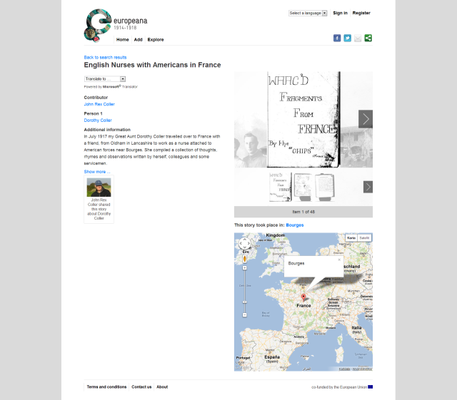
The 960 pixel viewport design of a story page. Media slide-show and story take equal prominence with the layout. Note that the storyteller and the story protagonist are also in focus.

The 960 pixel viewport design of a story page. Media slide-show and story take equal prominence with the layout. Note that the storyteller and the story protagonist are also in focus.

A story page at a lower viewport width. Note the change in layout of the top menu and that the story components are now stacked in a single column.

Posted in Europeana | Tagged , , , , , , , | 1 Comment

Europeana 1914-1918 re-designed: Content modelling, data entry and editorial support

As I mentioned in the introductory blog post there were some aspects of Europeana 1914-1918 that we felt needed to improved in order to make for a better user experience for our users.

Improving the consistency and quality of the content

Below are some of the actions we took to accomplish this goal. The data entry forms are implemented in a fluid grid to support our responsive design BTW.

  • We updated the underlying data model to make a cleaner separation between Stories and Memorabilia
    • We wanted to also treat both the person sharing the story and the persons the story is about into entities of their own. However, due to constraints we were unable to do so.
  • We updated the data entry forms, trying to strike a balance between simplicity and power. I’m not sure we made it completely on this one.
    • Specific improvements were made on batch uploading, copying metadata from story to memorabilia items and from memorabilia items to items
    • Simple help texts were integrated into the forms themselves rather than kept on separate help pages
    • We added some extra, optional, metadata fields to make more precise descriptions and classifications of stories and memorabilia possible
      • Specifically we added an option to make one image “the cover” of a story. The intention and hope is that contributors will apply this to portraits of the story protagonists.
      • Contributors too, are now allowed to upload an image/avatar to represent themselves
  • We’ve made it possible for contributors to revise and withdraw contributions after they have been submitted, reviewed and published. This was to make clear that the persons who share these stories “own” them, NOT Europeana.
  • When analyzing and modelling the content we kept in mind that what we did here would shape the way we could present and make findable the stories and memorabilia contributed
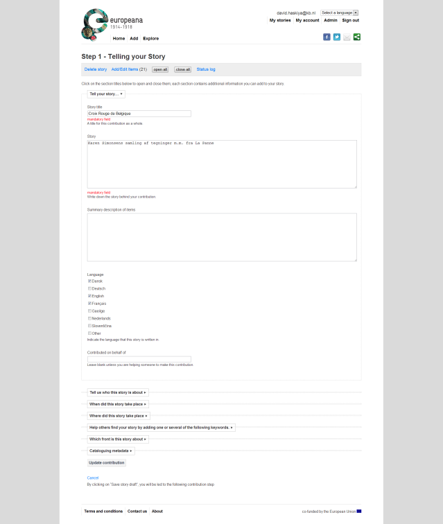
Screenshot from the storytelling form. Shown are the mandatory fields with optional fields for more detail in collapsed mode below.

Screenshot from the storytelling form. Shown are the mandatory fields with optional fields for more detail in collapsed mode below.

Improving the editorial support and localization

  • We needed to make it possible to localize the UI into any number of languages. A project goal over the next year is to hold Collection Days in all European countries touched by  the First World War after all.
    • We moved the copy text out of the HTML-markup and into separate YAML-files. Before this texts had to be edited in a mix of Ruby and HTML directly.
    • To simplify the actual localization work we signed up to Locale which helped our translation admins and translators in organizing and doing their work
  • We wanted to make it possible for our Marketing&Communications team to write news entries and choose stories to feature and for these to immediately show up in the UI
    • The legacy system lacked any true CMS-features at all and we couldn’t fit developing one into the scope of the project.
    • So we improvised by setting up a hidden blog which acts as a CMS and allows our site editors to feature content, which categories to feature as browseable, write news entries, and Editor’s Picks. And to do so in all languages we localize to.

In the next blog post: Designing and implementing the user experience.

Posted in Europeana | Tagged , , , , , , , | 2 Comments

Europeana 1914-1918 re-designed

Europeana 1914-1918 is perhaps my favourite Europeana project. Why? Because it’s a great project that just couldn’t have been done without us. Getting the EU-funding and having the pan-European network to then pull it off is, I think, unique to us at Europeana. The stories that the project collects are so rich in potential re-use elsewhere,  like for example exhibitions and immersive installations. Not to mention how much it means to the people who come to the Collection Days to tell the story of their grandfather or great aunt and how they were impacted by the Great War. As many wise people have concluded, in crowd-sourcing the process is perhaps more important than the outcome.

Screenshot of the Europeana 1914-1918 eCloud

The Europeana 1914-1918 eCloud splash page. Live, it’s projected in 3D on to a 9×3 meter screen.

Pity then that the old Europeana 1914-1918 site just looked so bad and interacted with the user so badly! Which is why a small Europeana team has been spending the better part of the last couple of months improving the site.  This work is now done and I think it’s perhaps our best work yet.

The new design is based on design principles and goals that I set up after having analyzed the project’s goals, the content it produces and how it produced by contributors and cataloguers. As always with a re-design the legacy system was perhaps the greatest constraint, but of course the two old favourites time and money made a showing as well.

The design principles and goals that we established:

  • Showcase the stories told and the memorabilia shared, not the project and its consortium members
  • Showcase the real persons these stories are about and the memorabilia they left behind
    • Showcase and empower the person, often a descendant of someone the story is about, sharing this story with us
  • Ensure a good user experience whether you’re visiting the site on your PC, tablet or mobile
  • Improve the search for stories and allow for more exploration of stories via browsing
To fulfill the principles and reach the goals there were some non-end user facing aspects that had to be upgraded as well:
  • Improve the consistency and quality of the crowdsourced content
  • Make it possible to localize the UI into any number of languages
  • Make it possible for our Marketing&Communications team to easily write news entries and choose stories to feature

In order to accomplish all of this we pretty much rebuilt the Europeana 1914-1918 front-end from scratch and made some serious renovation work on its RunCoCo back-end.  In follow up posts to this one I’ll go into a little bit more detail on how we tried to fulfill the principles and meet the goals listed above. First up some details on content modelling, editorial support and localization.

Posted in Europeana | Tagged , , , , , , , , | 3 Comments